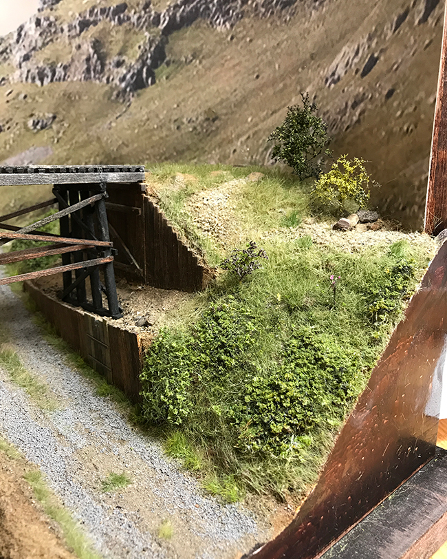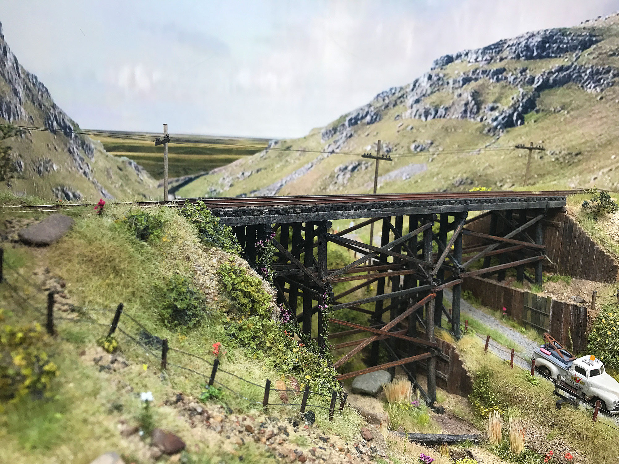
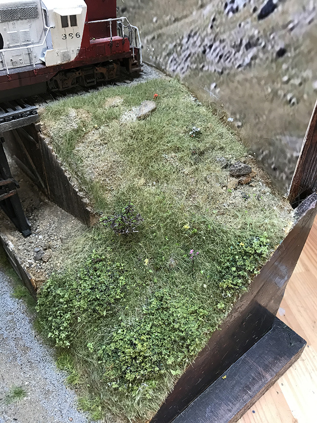
I keep staring at this scene of the east bank of the trestle I and keep coming to the conclusion that I’m not happy with it. The hardest part is that don’t know why. It should work. It ticks all the boxes: it has a mix of textures, materials, and colors; it avoids too great contrasts; I think it does a good job of reflecting the real world, while avoiding impressionism; and it tells a little bit of the story of the construction of the trestle. Yet I keep looking at the scene and finding it really boring.
When I look at art or a scene in a model railroad, regardless of the skills of the artist or the craft abilities of the modeler, the scene will reach out and grab me. I will have an emotional response to it: it will trigger memories, recognition and will appeal to my aesthetic senses. It will allow me to marvel at the makers skills and admire the modeler. this scene unfortunately does not of that.
Is it the colors? I’ve long admired the work of the photographer Joel Sternfeld. I have to admit I don’t own any of his books but I’ve seen his work in photographers magazines over the years. One series that really struck me was the Oxbow Archive series. These were a series of photographs of the landscape in a very dull light mostly set in winter. I always thought they were beautiful pictures and I often take similar photos of my own. I’ve definitely been channeling his work on The Depot which was deliberately kept very flat and avoided strong colors of any kind. I think that I’ve also tried to keep to that aesthetic on the diorama but in that instance, unlike the Oxbow archive and The Depot, this approach doesn’t work.

I’ve tried to sit down this weekend and figure this out.
The problems:
- Colors are too flat, especially the grass. The static grass is not vibrant enough. This was a result of using my usual Silflor static grass. It worked well enough on The Depot and of course it was used sparingly so the inherent problems of the flat colors were not yet noticeable. But in this setting – the diorama – the grass plays a much more prominent role and as a consequence reveals its problems blatantly. Yet is the solution brighter more colorful grass? Maybe not. The Joel Sternfeld picture to the left has only pastel colors with minimal changes of contrast (except for trees which partly plays the role of a subject). Bright green in this setting would surely ruin the overall effect. Yet if you look closely at the greens that exist in his photo you can see a certain vibrancy to them. The greens are emanating light rather than absorbing light. Maybe the secret is to start with a vibrant green and flatten it to reduce contrasts, and balance it within the overall scene. In other words start with the green and add a flattening color such as dry grass to bring down the strength of the color. If the green starts vibrant then it should retain that element even if reduced by a straw color.
- The lighting is too flat. My shop light is actually pretty warm but still seems to cast a flat light across the landscape. Combined with a shade of green that absorbs light instead of reflecting light the effect is of a cloudy day. Sometimes that’s a good thing but the combination of all the factors means that the overall picture is dull. What is the solution here? Change the lighting? Well maybe when I start taking photos of rolling stock I’ll be able to shine a warmer sunnier light on the diorama.
- There are no clear subjects to focus on and everything is too generalized. It’s all a blur: the rock features are not clearly defined, the grass is not marked out with edges anywhere and seems to just fade out. The features are too loosely defined. Maybe some trees and different colors will help. I’m thinking of adding small trees and definitely more flowers. I think there needs to be richer greens dotted around somehow.
Anyhow more work needs to be (and is being done) on this side. I’m not going to leave it alone until I happy with it. I’ve already added trees and defined the stony base more clearly. I’m adding more flowers and plants and colors in the next few days.